An unfortunate side effect of the mobile friendly web.
Why a shift in the way we surf the web has made websites all look the same and what I decided to do to fight it.
“So, what is a website?”. That was the question one of my clients asked me, and when I looked at it from his point of view, it wasn’t a stupid question. I know stupid questions. Recently someone unironically asked if I thought the internet was ‘here to stay’.
The way we view the web has changed.
Let us back track a little. Websites used to be awesome; a potential which stemmed from two things:
- Adobe (formerly Macromedia) Flash allowed for almost unlimited visual possibilities.
- Websites were static, meaning they looked one way, no matter what size screen they were being viewed on.
Then we started changing the way we looked at websites. The smartphone and tablet boom meant that websites needed to start catering to much smaller screens.
A responsive website is a mobile friendly layout that adapts visually to suit the size of the screen it’s being viewed on. Basic responsiveness may involve a change of layout at two or more sizes. Better websites are fluid responsive, meaning they perfectly adapt to suit any sized screen.
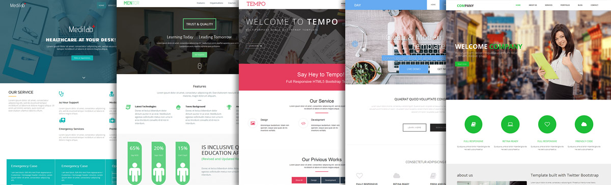
In terms of providing a better user experience across multiple devices, responsive websites are a good thing, but they’ve caused a problem; most websites are no longer awesome. In fact, the potential for a website to be both awesome and responsive, for a while, seemed like a paradox.
Flash is all but dead, and many website designs can only be distinguished by their varying choice of font, colours, and the logo at the top.
When my client asked what a website was, it was because he had looked at his competitors and noticed this lack of distinction.

Shaking things up
Starting with the aforementioned client, I pledged to start shaking things up. Since then I’ve been making websites like in the good old days (around 2008) that are also fluid responsive, and I’m not the only one. Awesome websites are making a comeback, so when you see one, learn from it.
Here are a few insights into what I changed:
Don’t design what you can build, build what you can design.
What I mean by this is, when you’re creating the visual design of a site (before a single line of code has been written), design it the way you want it to look. Avoid the trap of designing something that you know is possible to build. Worry about that later.
Learn new things
Flash is dead, but in its place have sprung loads of new ways of utilising media with up to date web standards.
Be inspired
When you see something on a website that looks cool, ask yourself why it looks cool and then figure out how it was done.
Navigate wisely
Even if the site is just a collection of different sized boxes, the navigation menu can be the holy grail of standing out from the crowd. Use it wisely.
Don’t use Twitter Bootstrap
Bootstrap is a good framework, but you can’t escape the fact that it tends to make websites look too similar. Design your own framework, then give it away, for free!
Remember, you can have your cake and eat it. You just need two cakes!


