How we created a brand with no logo.
As designers, we all know how important a logo is for a business. It is the kernel of a visual brand. If a client requested that we design them a brand with no logo, you can bet your boots that we would strongly advise against it and have a myriad of reasons to back it up.
You may then ask, why, as a business that designs logos, would you chose to create a brand that appears to have no logo at all?
It would be a fair question, after all, would you enlist the services of a destitute financial advisor or an obese fitness instructor?
Those analogies don’t quite line up, though. The fact of the matter is that, though risqué, our logo or lack thereof, was the best way to convey what we’re about. Here’s why.
The Premise
One of the beautiful things about digital arts is that worlds can be created from the ether. Something can be created from nothing, and the only limit is imagination.
Limitless possibilities: That’s what we wanted our brand to represent. We used the titular ‘Big Dot’ of The Big Dot Company, not as something that adds to the canvas, but something that subtracts from it, cutting a hole, and becoming a window into everything and anything.

Physical Application
Applying the concept of unlimited possibilities to our printed media required some out of the box thinking.
For our business cards, we considered using a lenticular design that would change depending on the angle at which it was being viewed. However, this could only convey multiple possibilities, not unlimited possibilities.

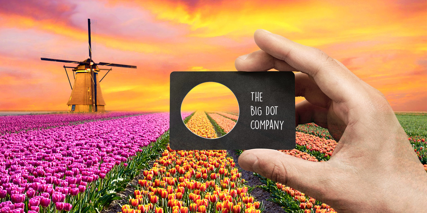
We went very literal with the window concept, creating die cut apertures in the cards which allow the holder to look through into anything, never seeing the same thing twice.
Digital Application
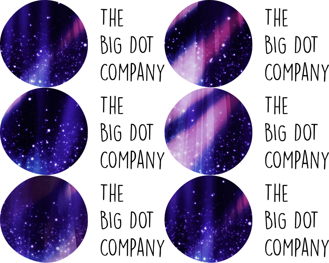
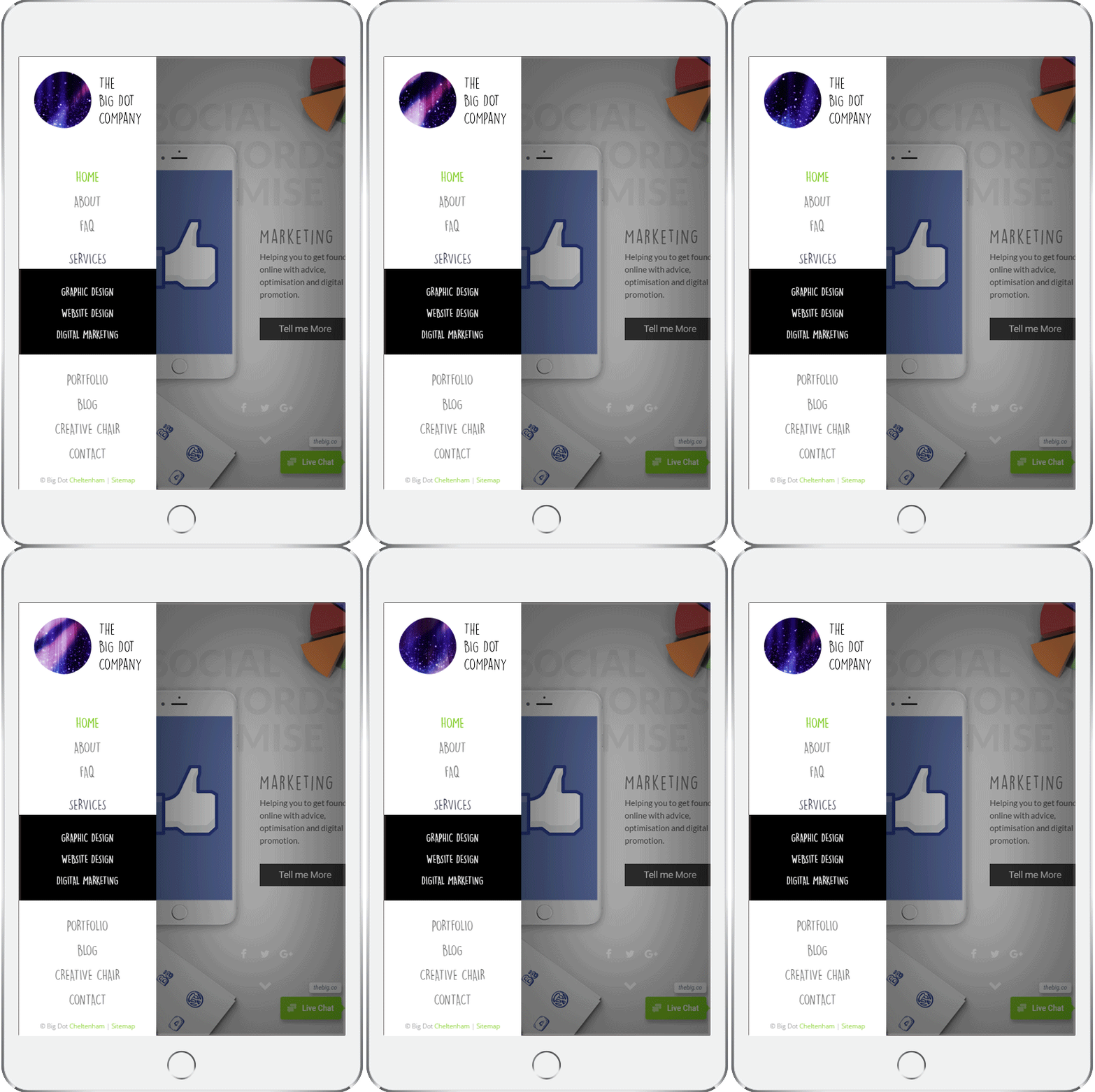
Translating the concept into a digital format had its drawbacks and advantages. For the “no logo” on the website, we used videos that covered a whole spectrum of possibilities from abstract emotion to profound humanity.


We created a series of 52 animated gifs that run on a four-second loop. We then created a script on our site that automatically changes the gif every week.


The disadvantage of this application is that it cannot be easily replicated on social media sites, such as Facebook or Twitter.
The Risks / Rewards
Creating a brand with no logo was always going to be risky, but the question is, do the risks outweigh the rewards?
The short answer is yes, but this is the sort of punt that one would only every get to take with their own business or with a particularly audacious client.
The cards have landed well. Business cards are usually taken out of politeness, given a brief glance and then resigned to the dark corners of a wallet, pending disposal.
People interact with our cards and show them to other people, which is great, but what about the digital brand?
We like our brands with a hint of chaos.
A client could happen across our website and be moved by whatever vista could be seen behind the ‘big dot’ on that given week. Conversely, they could visit it on a different day and meet the scene with indifference.
It’s also worth noting that having an animated “logo” is something that would not have seemed wise two or three years ago. It’s a response to the change in the way that people consume media; think about the way videos autoplay on the Facebook timeline and the popularity of animated emojis and memes.
Conclusion
Ultimately, not everyone will get the brand, and a brand which requires an explanation has a fundamental flaw. In that sense, it’s not ideal, but we’ve never gunned for ubiquity. See full project on Behance.


