An insight into the process of re-branding Krave
The brief: Health county wanted to change their branding and their target market completely. Previously, they targeted the health-conscious but wanted to go in a different direction by offering treats in the form of milkshakes and various tasty snacks.
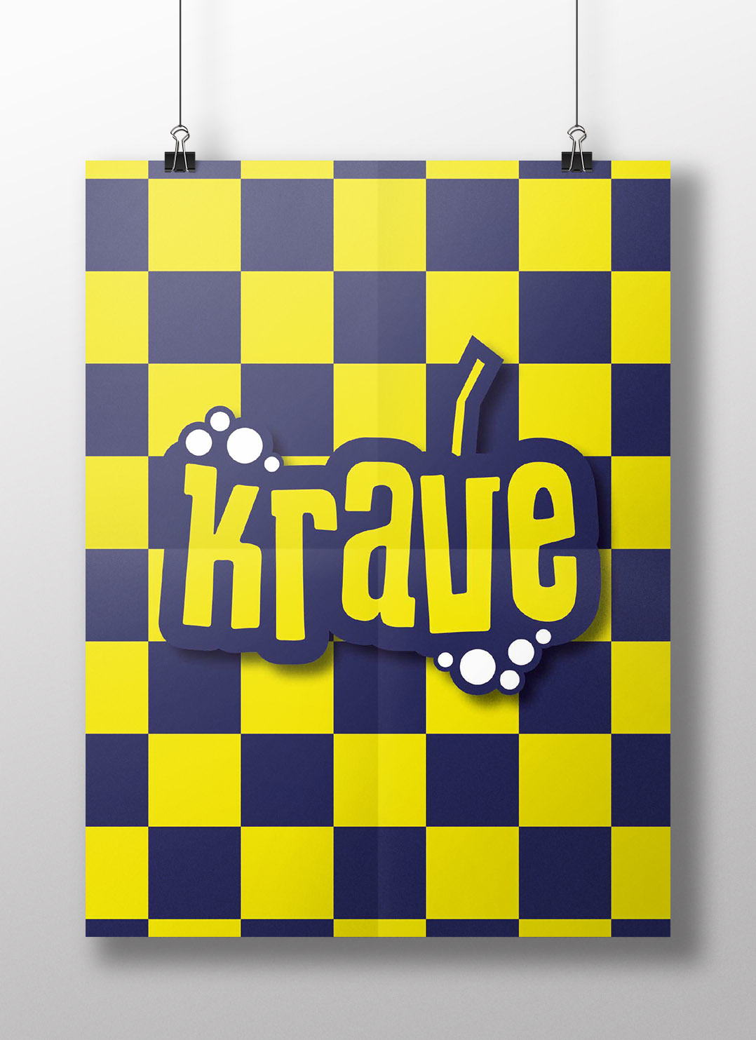
The new branding Krave was created from the following brief:
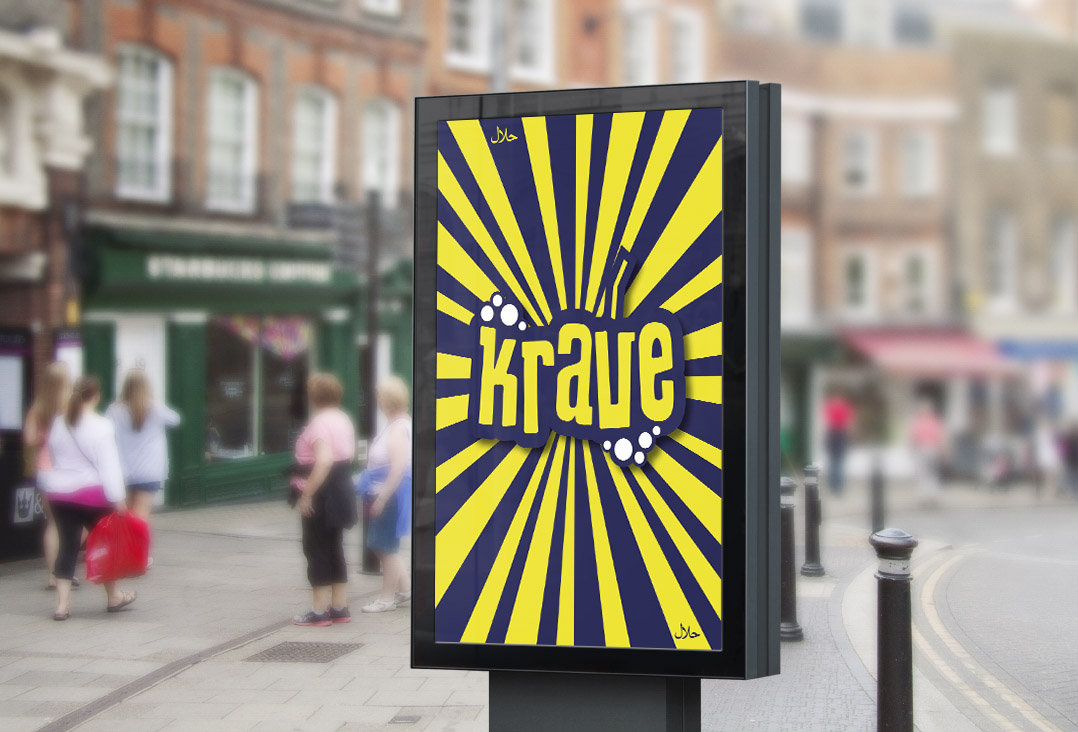
- The Krave brand must be bold/brash and stand out from the crowd.
- It should be fun and unusual.
- The logo should reflect the flagship product (milkshakes)
- The signage/posters should be appetising and attention-grabbing.
- The colour scheme must be easily recognisable across all designs.
After several concepts were created, the client chose design no.5, and several colour schemes were created.

When creating signage for our clients, we find that creating a mock-up of the design helps them visualise what the final designs will look like in situ. This can be invaluable to the process, and in this case, we used it to demonstrate how a large vinyl window graphic would look in place. This allowed us to revise the design several times before it went to print.
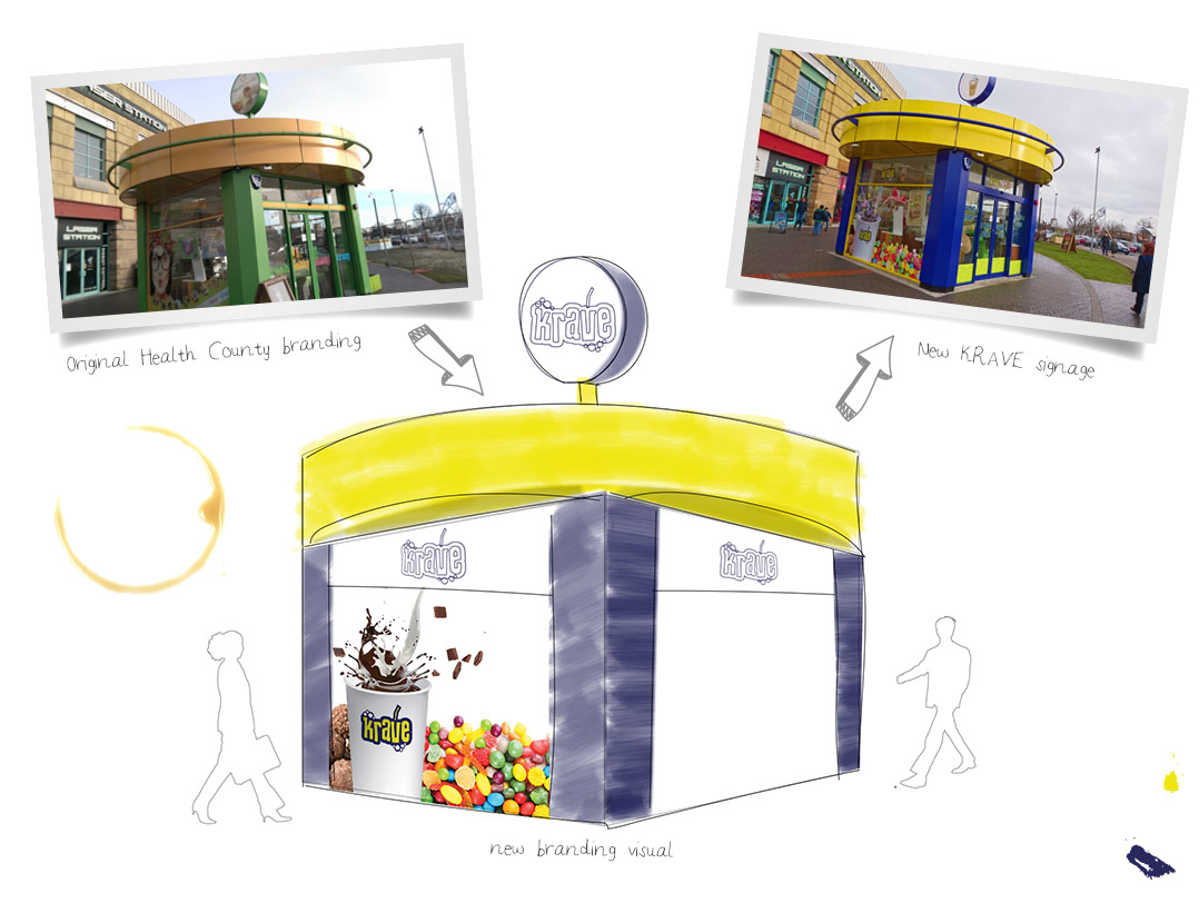
Because the design called for some complex cutting out, we needed to create a vector cutting line for the printer. Like all of the graphics in this design needed to be cut out, to begin with, we were able to achieve an accurate line by creating a silhouette of the graphics and then creating a vector outline.

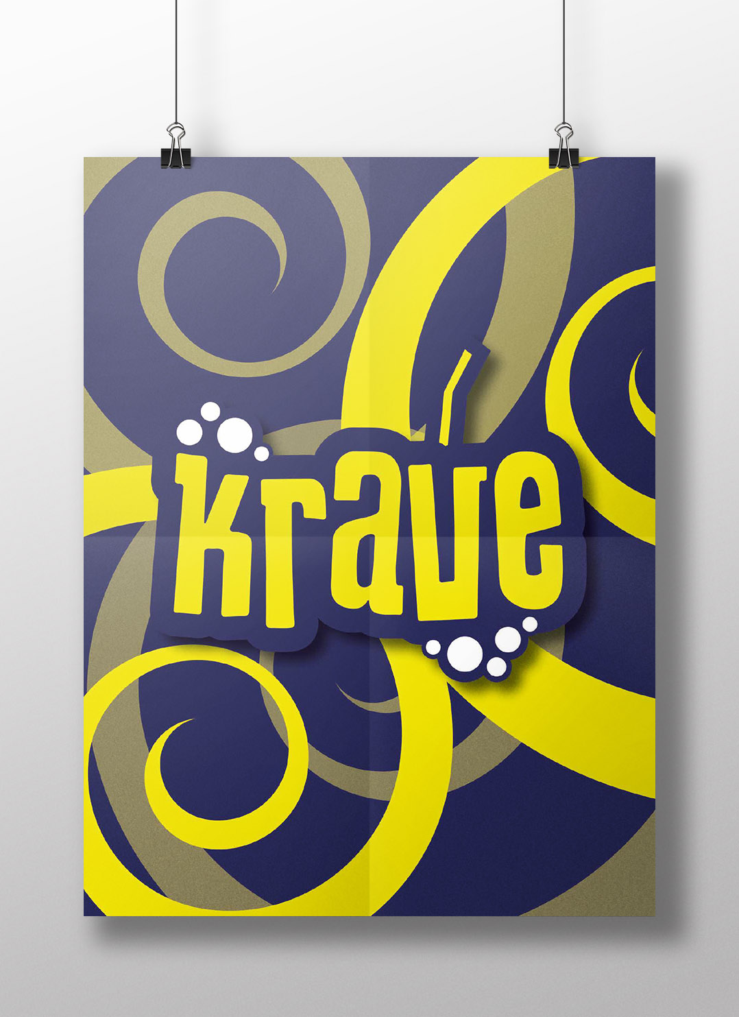
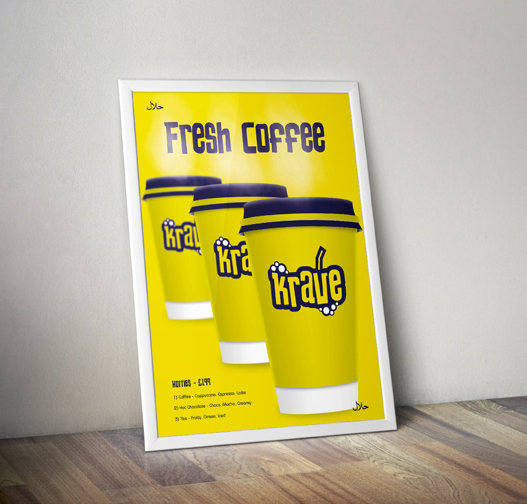
As part of the marketing strategy for Krave, we created 20 A1 posters to be featured in-store and around the Star City site in Birmingham. Some of the designs feature below.

With large scale branding design projects such as this, we create a comprehensive set of brand guidelines, which allows other vendors (such as printers) to work with the brand in the way that was originally intended, thus preventing brand dilution.


