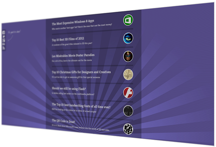
Tutorial explaining a great way to give a screen captures that photographed look.
A little while ago, I was working in a design studio on a catalogue that required screenshots of a website. The client wanted to make screenshots look like photographs so that they would match the existing images’ style. We achieved this by actually taking photographs of the website with a camera, but I couldn’t help thinking, there must be a better way!
After much experimentation, I finally found the perfect method of making screenshots look like photographs in Adobe Photoshop using techniques such as perspective, patterns, blurring, and gradient overlays.
Let’s begin! First, take your screenshot. You probably already have this, but if not, just press the print screen key in Windows or cmd + shift + 3 on an OSX before pasting your chosen image into Photoshop.


Hint: You can get a fuller screenshot by putting your browser into full-screen mode (F11 on most browsers).
Let’s start by giving the image the screen feel. Bear in mind that all of these steps are optional, and you can mix and match them to achieve your desired effect
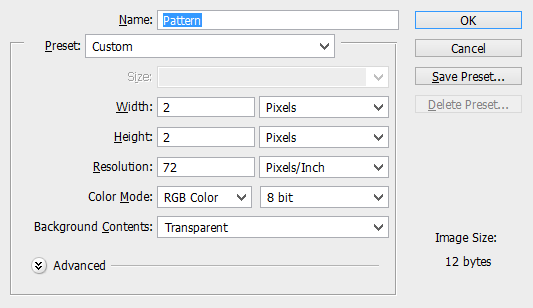
Create a new Photoshop 2px x 2px document with a transparent background.

Use any tool you like to colour either the top two or bottom two pixels black. You’ll have to zoom right in to do this. You could also
Click Edit > Define Pattern and name your pattern something like “My awesome pattern.”
Return to your screenshot and create a new layer.
Select everything by clicking edit > select all. Click on one of the selection tools and then right-click (cmd + click on OSX) and select fill.
From the fill, menu select pattern from the dropdown menu and choose your newly created pattern.
You can adjust the layer’s opacity to achieve your desired effect or even try adjusting the angle of the pattern. When you’re happy, merge both layers.

Make Screenshots look like Photographs.
Next, let’s adjust the perspective.
Click edit > transform > perspective. Clicking and dragging from one of the corners will change the perspective of the image.
Once you’ve got it looking how you want, you may wish to reduce the width a little, so it doesn’t seem so elongated.
We’re getting there now!

Select the gradient tool and then chose the black fade out swatch and draw across a new layer to give the impression the image is fading out.

To give the appearance of a depth of field, click on the quick mask icon and then use the gradient tool to draw across the image, creating a mask.
 Click the quick mask icon again and then go to image> blur > Gaussian blur, adjusting the blur’s scale to suit your needs.
Combining these techniques can produce quite a pleasing result, and varying them can produce some interesting ways to display
screenshots.
When you finished, just crop the image, and you’re all done!


