We explore the pros and cons of cheap logo design.
A logo is the visual representation of your business, a one glance sales pitch. It is the kernel of your whole operation, so it’s a pretty important thing to have. Having said that, a bad logo is worse than having no logo whatsoever, which is why cheap logo design should be approached with extreme caution. But how much should a logo cost?
Well, the easy answer would be to say that you get what you pay for. Still, we would be hard-pressed to tell you why the Pepsi logo was worth $1,000,000 or the BBC (which is essentially a font in a box) cost over £1 million, and in fact, many people would take a large sip of their drink and then spit it out comically if you told them the London 2012 logo cost over £500,000. However, the fact that these companies were willing to spend that sort of money on their logo demonstrates the importance of having a good brand.
On the other end of the scale, you only need to type “cheap logo design” into Google to find a mass of companies offering logo design for as little as £20.
Curious, we enlisted one of these companies’ services that offered us a package that included a logo design with unlimited revisions for a meagre £40. We won’t name the company in question, but like most of these outfits, they’re based in India with a westernised website and a .co.uk suffix on their domain.

The made-up brief
Redesign or New: New
Logo Type: Fun
Industry: Entertainment and Media
Words In Logo To Appear: Theme Park Review
Brief Description Of Business: It’s a site that will provide reviews on various theme parks and attractions in the UK, including Alton Towers and Drayton Manor.
Colours In Mind: Similar colours to Alton Towers logo
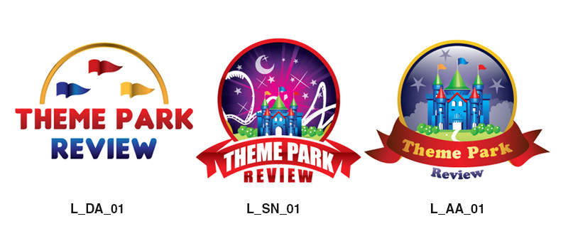
Below is the blow by blow account of our dealings with the designer(s) as we try to get a cheap logo design. To begin with, they sent three designs based on our initial brief.

While not very good, a couple of the logos did show that the brief had been acknowledged. We responded:
“L_AA_01: This is probably the most promising one, but I want the inner colours to be more purple like Alton Towers. I want more detail on the ribbon and circle so they look more photorealistic so that the ribbon will be more detailed, the yellow circle will look like real brass and can we make the look like a glass dome-like a snow globe? Inside the circle, I want silhouettes of rides and make the castle a silhouette too. Thanks”
A couple of days later, they sent these:

This wasn’t a great development considering the wait. We said:
“We’re heading in the wrong direction here. We want a more photo-realistic red ribbon like this:

And a brass rim like this (but darker)

With a glass effect on the dome. Bring ‘review’ up onto the same row as ‘Theme Park’ and make sure it aligns with the banner. Remove green from the logo. Add rides, as requested before.”
Two days later, these arrived.

For some reason, they had adopted a nautical theme?! We said:
“I’m afraid this is not going well. We feel that you’re not fully grasping our feedback. Let’s try this again. Go back to L_AA_Revision_1_02. We don’t want a porthole looking out into the sea; it’s not relevant to the business. We do want the following:
- A realistic metal looking ring around the outside.
- A realistic-looking ribbon across the bottom with all three words inside it, properly aligned.
- Add the silhouette of rides in the background.
- Make the castle a silhouette and put less emphasis on it.
Thank you.”
They sent this:

By this point, a couple of weeks had elapsed, and it was clear that not all of our feedback was being taken on-board (nautical pun there), and we were just repeating ourselves. We commented:
“Please improve the texture and the detail on all of the gradients to provide a more photorealistic look, as per the examples we sent you earlier. Smaller circle, make the rim from brass. Less emphasis on the castle. More rides.”
They sent this:

This time, they had paid a little more attention to our feedback, but it was clear that the logo’s quality was not going to improve much, regardless of how many revisions there were. We noted:
“This is better but still needs much improvement:
- Ribbon and text need to flow in a smoother arc.
- Rides look a bit rough and edgy; clean up.
- The composition needs rejigging as it is too empty at the top.
- The ribbon doesn’t look real enough.
- Brass rim doesn’t look real enough.”
They sent this:
At this point, we had essentially given up, so I decided to have a little fun. We said:
“This is better, but can we have it in a single colour, please.”
They sent this:

Our response:
“We said a single colour, not different shades of the same colour.”
They sent this:

Humouring them, we said:
“This is great; we’re nearly there. Now can you remove the dome, tower and the rides, etc., so we just have the banner saying theme park review and then above it put a picture of a duck but make it really, really big and make the duck have polka dots?
Oh, and finally, could you change the font to comic sans?”
They sent this:

At this point, we decided to take a crack at a cheap logo design ourselves. We said:
“This is top-notch, really good stuff. I hope you don’t mind, but I had a crack at this myself. I’m no designer, so I was hoping you could give me some feedback so I can make it look as good as your version.”

We weren’t surprised when they didn’t respond, and to be honest, we felt a little bad for stringing them along.
What was clear, though, is that no amount of revisions would have resulted in a good logo design. If we had genuinely needed this logo to start up a business, then we would have just wasted £40 and, more importantly, about a month of our time.
During this cheap logo design process, we had no direct contact with the designer and at no point did they ask us any questions or say anything at all.
When designing a logo, a good designer will ask you lots of questions to get to the root of your operation and find out what makes your business tick. It should be a productive back and forth process with abundant communication between two people.
With a good designer, getting your brand right should be as important to them as it is to you, so it’s unlikely that you’re going to fire up that sort of passion for £40. It’s difficult to say how much you should pay for a logo but start by approaching some designers, examining their portfolios, and getting a handful of quotes before making your decision.
“If you think it’s expensive to hire a professional to do the job, wait until you hire an amateur.”
The above quote by Red Adair is one of our favourites, and it can be applied to pretty much any situation in which you require professional service. Remember, cheap logo design is cheap for a reason.


